Designing better digital
classroom experiences
Superr | 2025
Superr is an edtech company building tools that support teaching, learning and classroom operations for schools.
Over my time at Superr, I worked across Superrbook and the Admin Portal, designing experiences for students, teachers and school administrators. My focus was on simplifying complex classroom workflows, improving information architecture and creating intuitive experiences across the platform.
For interaction heavy features, I often used Cursor to prototype behaviours directly in code, validate edge cases and refine motion and micro interactions before development.
This case study highlights a collection of the features, systems and interaction patterns I helped design and ship while building a more connected digital classroom experience.
My Role
- Designed and shipped experiences across Superrbook and the Admin Portal for students, teachers and school administrators.
- Simplified complex classroom workflows through navigation, information architecture and interaction design.
- Designed learning experiences including assignments, quizzes, notebooks, whiteboards and collaborative tools.
- Created workflows and dashboards for school device management and administration.
- Collaborated closely with product managers and engineers from concept to implementation.
Areas of Ownership
Learning Experiences
Assignments, quizzes, notebooks, whiteboards, reports and classroom collaboration.
Systems & Information Architecture
Navigation structures, content organisation and workflow simplification across the platform.
Interaction Design
Geometry tools, stickers, drawing experiences, tool behaviors and micro-interactions.
Admin Operations
Device management, operational dashboards, monitoring workflows and quick action systems.
Prototyping
Cursor based prototypes used to test interaction logic, usability edge cases and motion before implementation.
How I approach design
I enjoy working on systems where interaction, usability and structure come together. My process usually involves understanding workflows deeply, simplifying complexity, exploring multiple interaction patterns and prototyping ideas quickly to test assumptions early.
Lately, I’ve been using AI-assisted workflows with tools like Cursor and Claude Code to prototype interactions, explore ideas beyond static screens and iterate faster. I also use them to build and ship small features, helping me test ideas more directly and understand implementation constraints earlier in the process.
Context Switching Between Learning Resources
01 / 03TL;DR
Designed a resource switcher that lets students move between textbooks and notebooks without breaking their learning flow.
Problem
Learning often required jumping between different resources. Every switch interrupted focus.
Current Workflow

Read

Go back

Browse

Find notes

Continue writing
Repeated many times during every study session.
Pain Points
1. Too many steps to switch
2. Breaks study flow
3. Interrupts note-taking
4. Hard to resume where you left off
Design Goals

Faster switching
Reduce navigation steps

Preserve learning flow
Keep students focused

Minimal interface
Only appears when needed

Familiar mental model
Feels natural to use
Exploration
Part 1 - Finding the right entry point
How should students open the switcher?
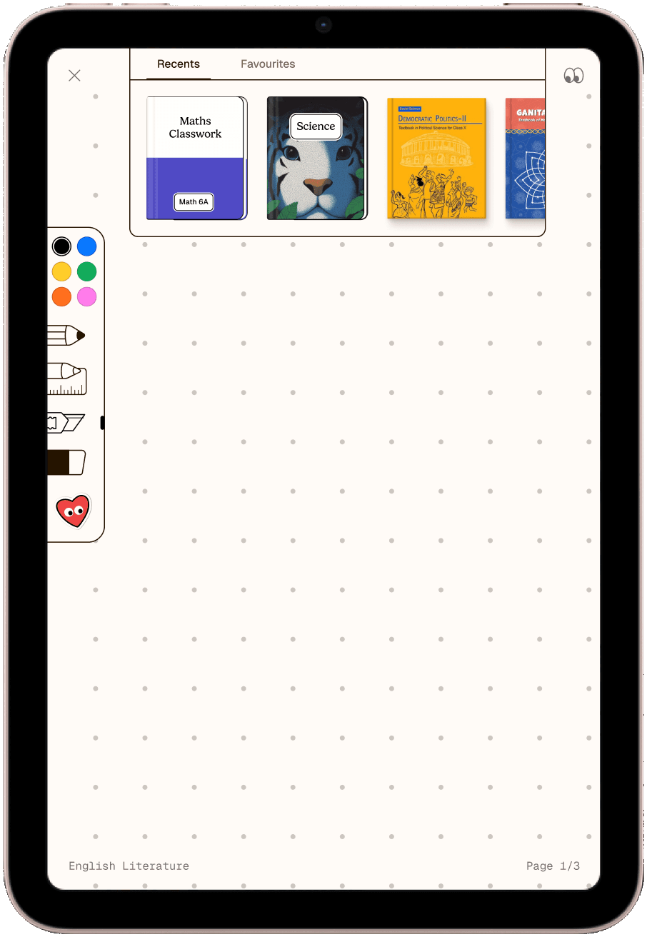
Idea
Single Pull down swipe from top
Swipe down from the top edge to open the resource switcher.
Why I explored it
Fast and gesture first access
Let students access resources quickly without any visible UI taking up space.
Why I moved away
Conflicted with system gestures.
It was easy to trigger accidentally and clashed with system gestures.
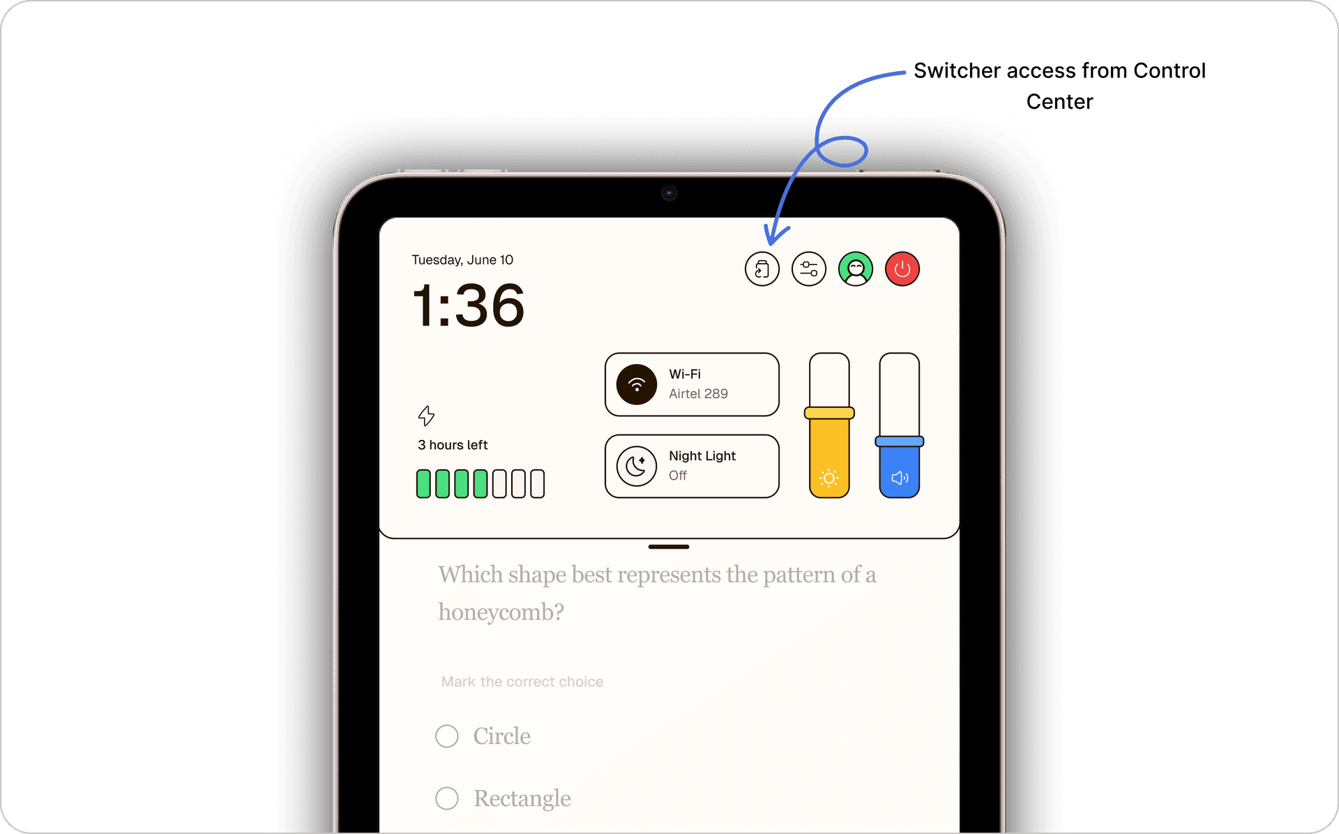
Final entry point (Two finger swipe down + Control Center access)
The switcher opens with a two-finger swipe down from the top edge, with a direct entry point from Control Center when needed.
Why this direction?

Fast to access
A natural gesture that gets students to their resources in one motion.

No persistent UI
Keeps the notebook workspace clean and focused.

Easy to discover
Provides a familiar way to access the switcher when needed.
Part 2 - Designing the Switcher
What should appear when students open it?
Students primarily switched resources for two reasons
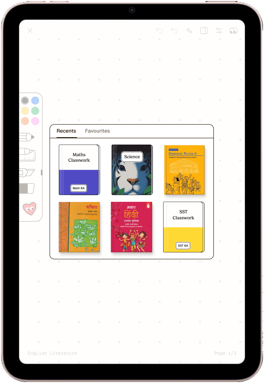
Why it didn’t work
1. Disconnected interaction
The gesture opened the switcher, but the resulting UI felt separate from the workspace.
2. Too app like
Tabs and sheets introduced patterns that felt unfamiliar in a notebook first experience.
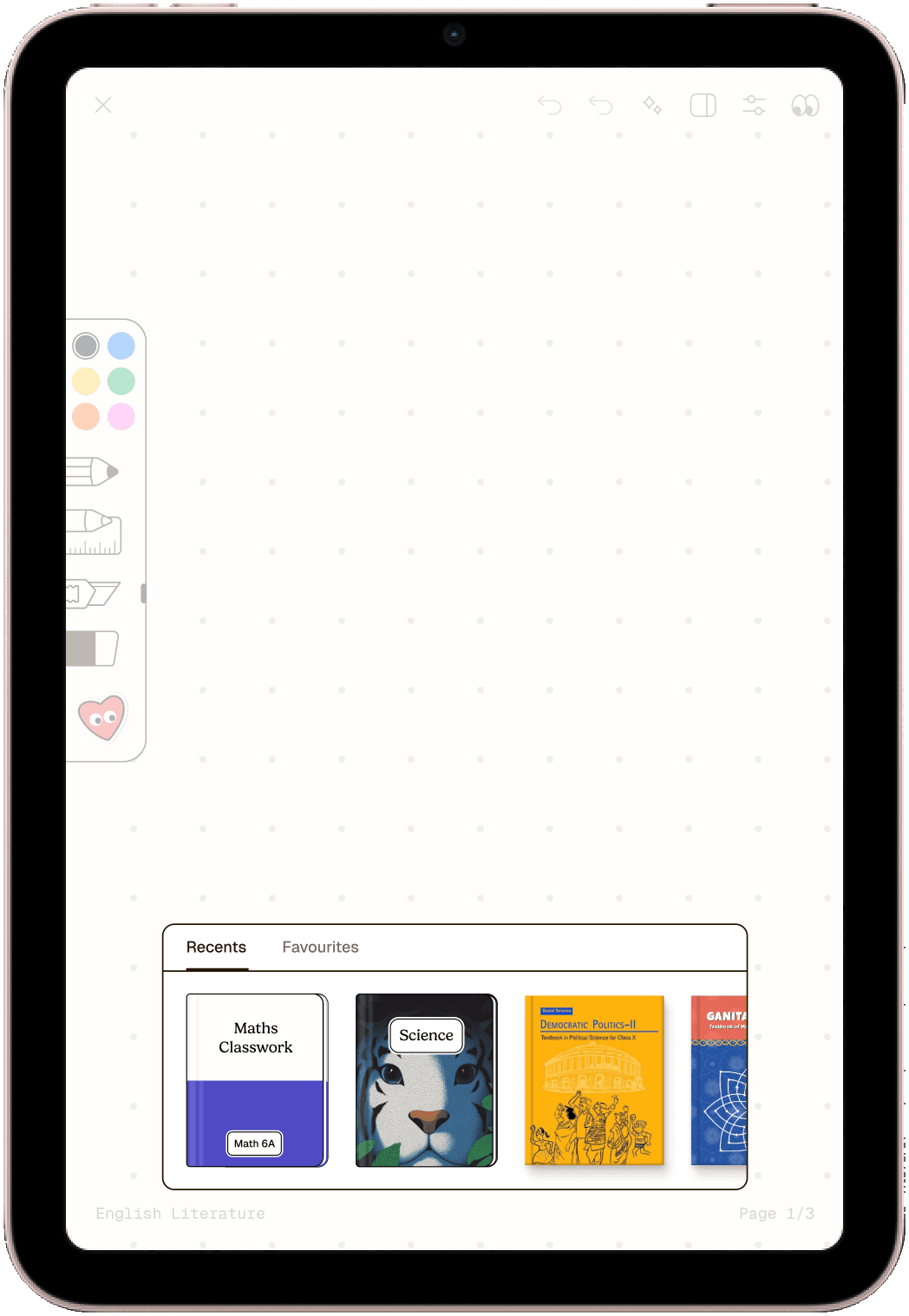
Final Direction
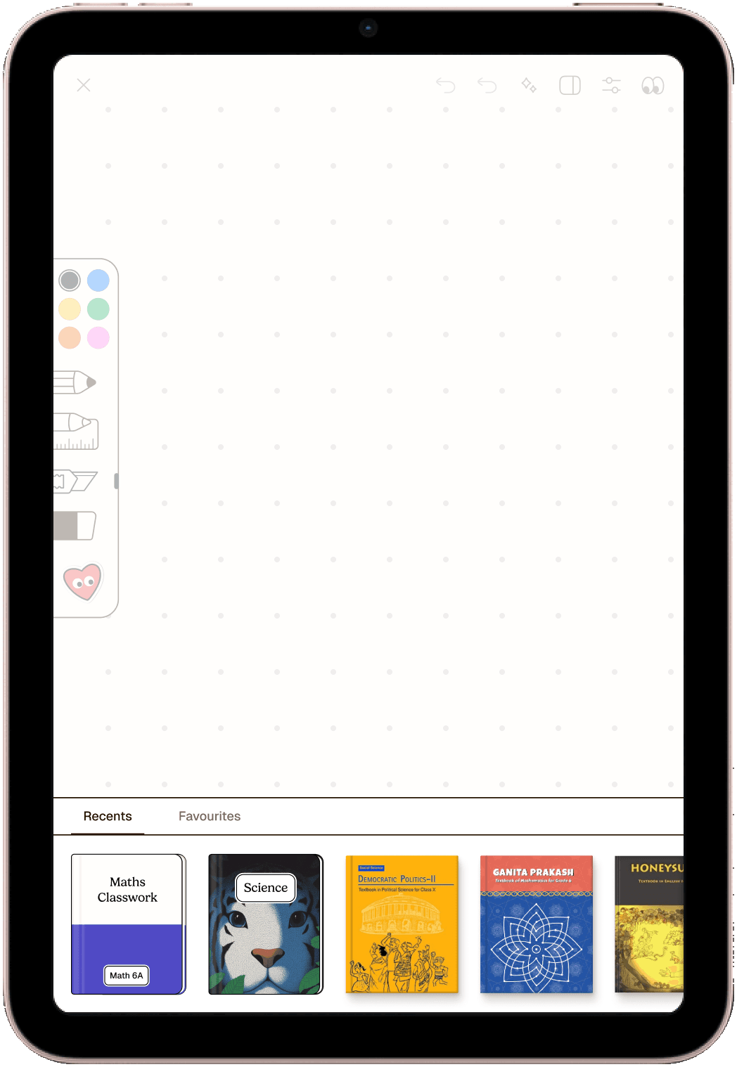
A switcher accessed through a two-finger swipe down or directly from the Control Center, combining Recents and Favorites within a single surface.
Designing for Edge Cases
A big part of this project was thinking beyond the ideal flow. The resource system had to work across different states without making the everyday experience feel more complicated.
Current resource in Recents - Deciding whether the resource a student is currently viewing should appear in their recently accessed list.
Deleted notebooks - Handling previously accessed content that is no longer available.
Empty Recents and Favorites - Making empty states still feel intentional rather than broken.
Preserving reading position - Helping students pick up where they left off without unnecessary effort.
What I’ll be measuring next (Metrics)
The experience is currently being prepared for launch, so I don’t have user metrics to share yet. Once it’s live, I’ll be looking closely at:
- 1.
Feature adoption
How many students start using the resource switcher?
- 2.
Return usage
Do students come back to previously accessed resources?
- 3.
Time to find content
Can students get to what they need faster?
- 4.
Reading continuity
Does preserving position make it easier to pick up where they left off?
- 5.
Qualitative feedback
What feels intuitive, confusing or unexpectedly useful?
Reflection
A few things I learned while working through this:
The fastest interaction isn't always the best one.
The pull down gesture was quick, but it conflicted with system level gestures and introduced unnecessary friction.
Small entry point decisions can have a big impact.
Where and how students access their resources shaped the entire daily learning flow.
Handling edge cases early helped keep the core experience simple.
Thinking through empty, deleted and returning states prevented complexity from showing up later.
Live Quizzes
Created interactive classroom experiences that made classroom participation feel more active and engaging during lessons.
Focused on
- Real-time classroom interaction
- Faster teacher controls
- Clear participation states
- Keeping students engaged during sessions
Geometry Tools: Making Digital Tools Feel Physical
02 / 03The Challenge
Students already know how rulers, protractors, and compasses work on paper. The challenge was translating those familiar behaviors into digital interactions without making students learn a new system.
The experience needed to support drawing, measuring, rotating, and positioning tools while remaining intuitive across different age groups.
Understanding Existing Patterns
Before designing the interactions, I studied how geometry tools were implemented across learning platforms, whiteboard products, and drawing applications.
What I noticed
- Controls were often separated from the tool.
- Interactions felt more technical than physical.
- Students had to learn new behaviors instead of relying on familiar ones.
If a student already knows how the tool works on paper, the digital version should behave as closely as possible to that mental model.
Designing Around Physical Behaviors
Instead of inventing entirely new interactions, I started with behaviors students already understood.
Move - How would a student naturally reposition a ruler?
Rotate - How would they expect a protractor to turn?
Draw - Where would they expect to start an arc or circle?
Measure - What feedback should appear while measuring?
Prototyping Interactions in Code
Many of these behaviors were difficult to evaluate through static Figma screens alone.
Why I prototyped in code
Static screens couldn’t answer questions like:
- Does rotation feel natural?
- Do controls stay accessible while a tool moves?
- Does the interaction still work at the screen edge?
I used Cursor to prototype and test these behaviors early, helping validate interactions before development.
Designing for Edge Cases
As the tools became movable and interactive, I considered states beyond the ideal flow.
Screen boundaries
Defined how tools behave when moved close to or partially beyond the screen edge.
Accessible actions
Ensured contextual actions repositioned appropriately instead of becoming inaccessible.
Default placement
Considered where each tool should appear initially without obstructing the workspace.
Different screen sizes
Tested how positioning and interactions could adapt across available space.
Progressive discovery
Considered how advanced functionality could be revealed without overwhelming students.
Prototyping these scenarios early helped define clearer behaviors and reduce implementation ambiguity.
Key Decisions
Actions follow the tool
Instead of sending students to a separate toolbar, relevant actions appear alongside the active tool.
Why: Reduces visual scanning and keeps the interaction connected to the object being manipulated.
Reveal controls when they're needed
Relevant controls appear as students interact rather than presenting everything upfront.
Why: Keeps the workspace simpler while allowing students to discover functionality naturally.
Use familiar gestures
Movement, rotation, drawing, and measuring build on interactions students already understand.
Why: Reduces the amount of new behavior students need to learn.
The Outcome
The final interaction model allowed students to:
- Manipulate tools directly
- Use familiar gestures for movement and rotation
- Access relevant actions in context
- Discover functionality through interaction rather than complex controls
What I learned
Designing interaction heavy experiences required testing behaviors beyond static screens. Prototyping in code helped me explore motion, edge cases and implementation constraints earlier in the process.
Helping school admins manage devices better
03 / 03Problem
School admins needed a quick way to monitor device health, assignments, classroom activity, and operational issues without feeling overwhelmed by large amounts of data.
Approach
I designed dashboards and workflows focused on quick scanning, prioritization, and actionable insights so admins could identify issues and take action faster.
Focus Areas
- Information hierarchy
- Scannability
- Status visibility
- Quick actions
- Reducing operational effort
Reflection
What I learned
Designing for clarity at scale.
Designing classroom experiences taught me that students and teachers process information very differently. Every interaction needed to feel simple, focused, and easy to navigate without becoming overwhelming.
Thinking beyond individual screens.
The work pushed me to think more deeply about workflows, interaction systems, scalability, and how features connect across students, teachers, and admins instead of treating each screen separately.
A large part of this work involved interconnected features and evolving systems. I’d be happy to walk you through the deeper explorations, iterations, prototypes and shipped decisions in a conversation or on a call.
To view the full case study, please open the link on a desktop 🙂